Wednesday, November 25, 2009
 Wit
Wit

Steverino your android buddy brings us:
Cool Covers from Comics gone by
Let's start with this: Marvel's EXILES
Vol 1, No. 23, May, 2003

Cover art by: Kev Walker
It's the concept that helps this cover into the cool category. Simply put: It's Ironman in Doctor Dooms cape.
This looks to be a canvas painting and that gives it a nice feel. Add a pissed off Ironman with beat up armor and put him in an old dirty cape and hood and you can't miss.The art under this cover is just as strong. I likey.
Moving on I bring you: DC's SUPERMAN: THE MAN OF STEEL
No. 44, May, 1995

Cover art by: Bogdanove & Janke
What do you say? It's in your face fun, lots of color, and wierd.
Check it out. Take a good look. It never gets dull. "3 D Kent". I did not know that was his address. Cool. I like our perspective looking up the door, past the big "S" logo, thru that scary knife, and into the mouth of that goofy head. Any cover (post 1970's) that can pull off goofy to me = cool. The good cover makes me want to read on. I think I will.
How about a back cover: Innovation's LOST in SPACE ANNUAL
Vol 1, No. 1, 1992

Back cover art by: J.C. Palmer & Q Kmoore
Well, this is one of the best pieces of LIS art I have seen. Check the large view of this illustration. The resemblance to the actors us uncanny. I have seen a lot of bad Dr. Smiths. The artwork has it all. The Jupiter 2, the Robot, and the Chariot. Do I see Debbie the Bloop inside? I'm glad I pulled this book. Inside art is just good. It is not helped by a weak story. Lots of extras though . Front cover...just, ehh. Read this one back to front.
No really: Kitchen Sink Comix: YARN MAN
No.1, Oct, 1989

Cover art by: Don Simpson
He's MEGATON MANS pal. I'll have to look him up folks.... oh yea, him. There he is on the back cover. The front cover is so warm and fuzzy I ......nodded off. It is cool fun.
Simpson must have had a blast painting this. The solid yellow and strong type round out a sweet cover. I want to feel his tongue.
Lets wrap it up with a masterpiece: Marvel's FANTASY MASTERPIECES
Vol 1, No 7, Feb, 1967
This looks to be a canvas painting and that gives it a nice feel. Add a pissed off Ironman with beat up armor and put him in an old dirty cape and hood and you can't miss.The art under this cover is just as strong. I likey.
Moving on I bring you: DC's SUPERMAN: THE MAN OF STEEL
No. 44, May, 1995

What do you say? It's in your face fun, lots of color, and wierd.
Check it out. Take a good look. It never gets dull. "3 D Kent". I did not know that was his address. Cool. I like our perspective looking up the door, past the big "S" logo, thru that scary knife, and into the mouth of that goofy head. Any cover (post 1970's) that can pull off goofy to me = cool. The good cover makes me want to read on. I think I will.
How about a back cover: Innovation's LOST in SPACE ANNUAL
Vol 1, No. 1, 1992

Well, this is one of the best pieces of LIS art I have seen. Check the large view of this illustration. The resemblance to the actors us uncanny. I have seen a lot of bad Dr. Smiths. The artwork has it all. The Jupiter 2, the Robot, and the Chariot. Do I see Debbie the Bloop inside? I'm glad I pulled this book. Inside art is just good. It is not helped by a weak story. Lots of extras though . Front cover...just, ehh. Read this one back to front.
No really: Kitchen Sink Comix: YARN MAN
No.1, Oct, 1989

He's MEGATON MANS pal. I'll have to look him up folks.... oh yea, him. There he is on the back cover. The front cover is so warm and fuzzy I ......nodded off. It is cool fun.
Simpson must have had a blast painting this. The solid yellow and strong type round out a sweet cover. I want to feel his tongue.
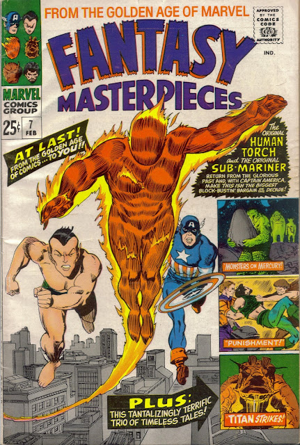
Lets wrap it up with a masterpiece: Marvel's FANTASY MASTERPIECES
Vol 1, No 7, Feb, 1967

I've gotta include one oldie. This book reprints stories from the golden age. This cover is a fine example of old printing with classic design form and great colors. I really like the preview boxes in the lower right. Old school. Cool.